Overview
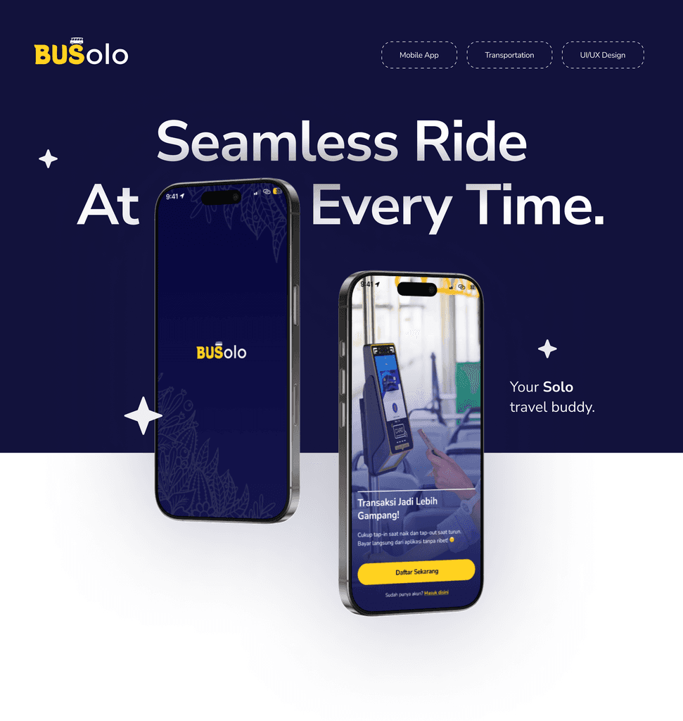
BUSolo is a smart public transportation application designed to enhance urban mobility in Solo. Inspired by systems like TransJakarta, it aims to provide a reliable, efficient and affordable commuting experience for residents and tourists alike.
Problem
Public transportation in Solo lacks integration, real-time information and convenience, making it inefficient and underutilised.
Solution
BUSolo combines real-time bus tracking, route planning and easy digital ticketing in one app to make travelling around Solo simpler and better.
Process
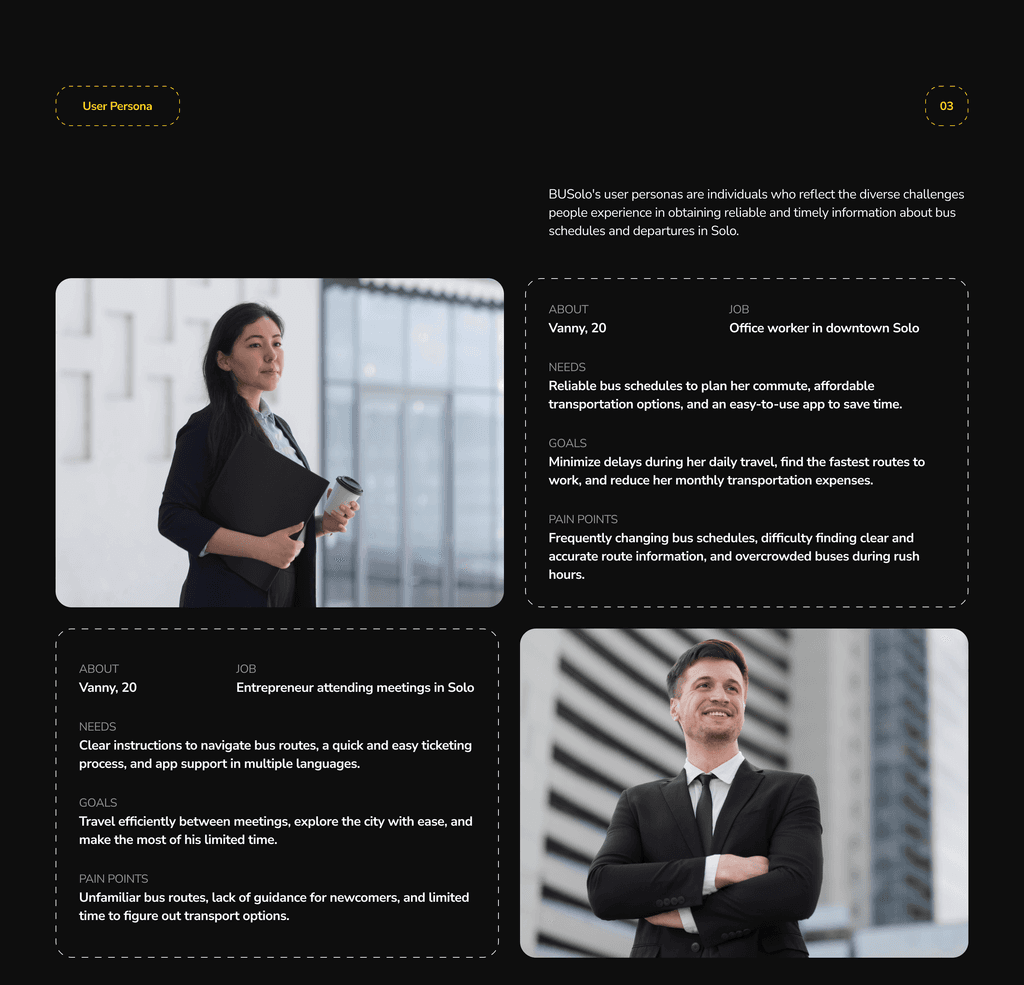
Research, define, ideation, prototype, testing — with the deliverables named up front for each phase so nothing got skipped under deadline pressure.
How might we
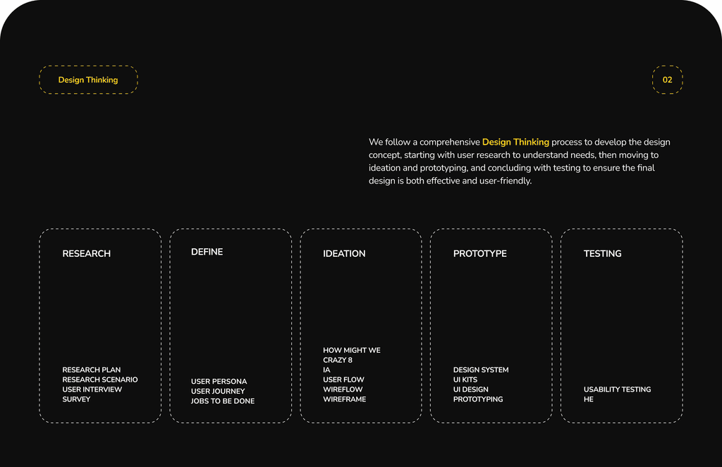
Four problems came out of the research, and each one was turned into a How Might We before any solution was allowed near it: uncertainty about arrival times, uncertainty about seat availability, buses too crowded, and the hassle of a physical card.
Persona
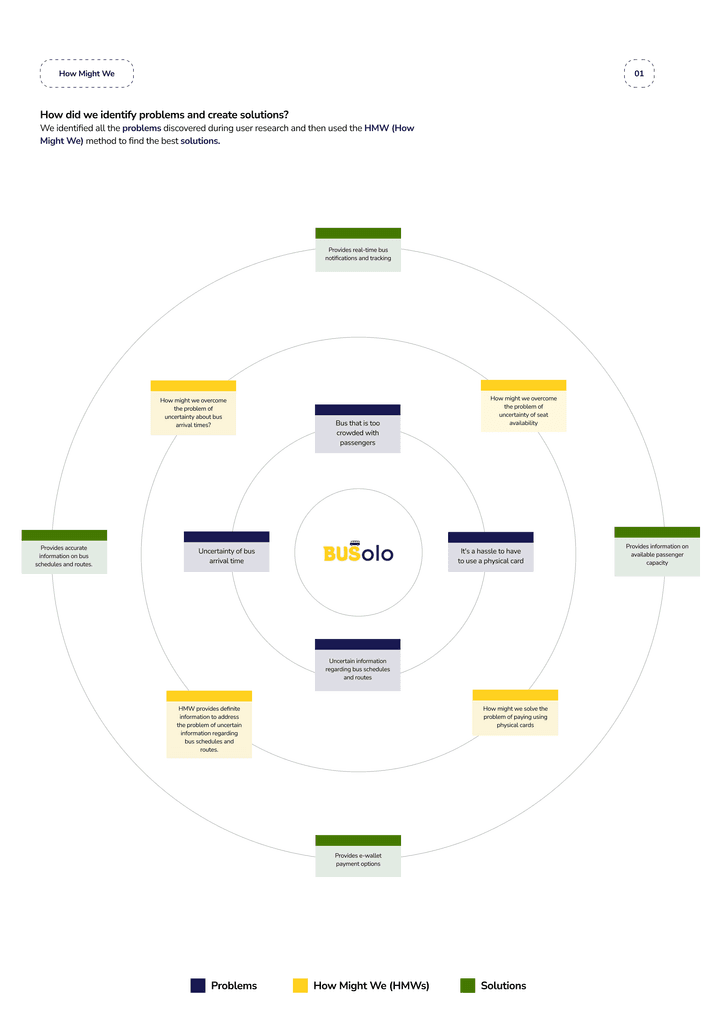
Two personas at opposite ends of the same system: a daily commuter who needs reliability and a visitor who needs legibility. Designing for both is what pushed the app toward plain language and away from insider route codes.
Jobs to be done
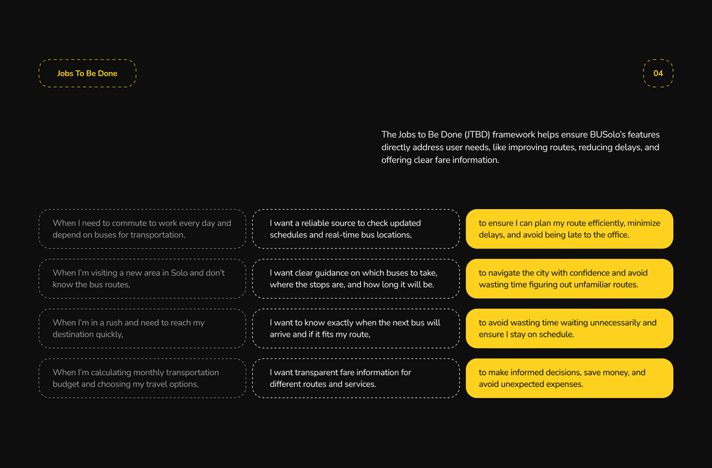
The JTBD framework kept features tied to a stated need rather than to what was fun to build.
User flow
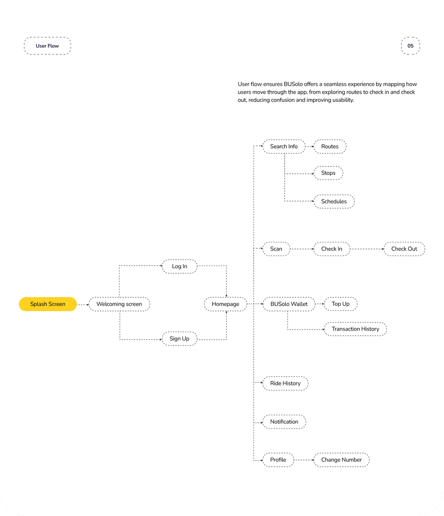
From splash screen through to check-out, with the wallet as a first-class branch rather than something buried in profile. Scan → check in → check out is the spine of the app.
Wireframes
Design system
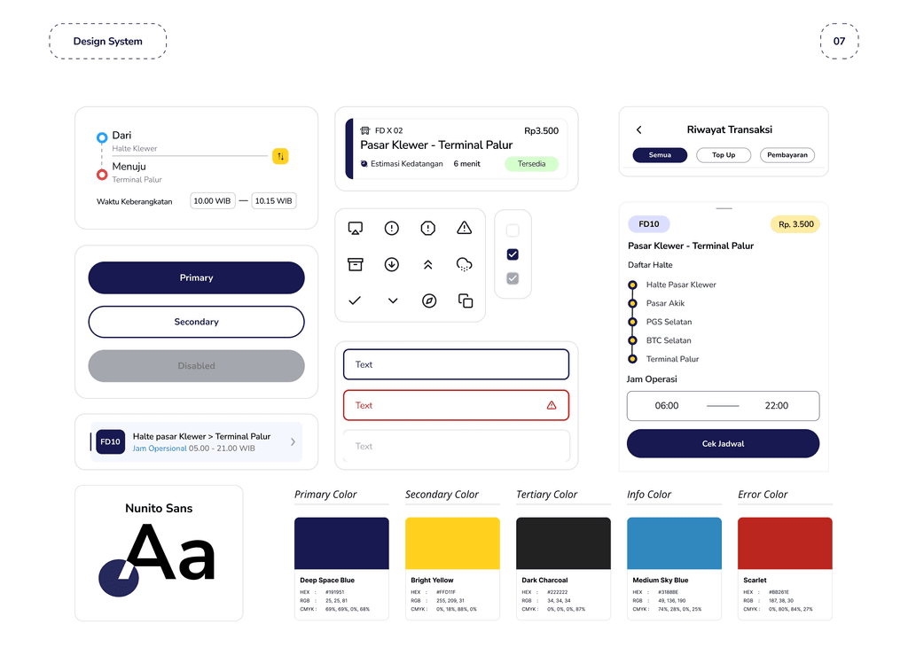
Nunito Sans, with Deep Space Blue as primary and Bright Yellow as the single action colour, plus charcoal, sky blue and scarlet for information and error states. Route cards, timetable rows and the ticket component are all built from the same tokens.
Brand
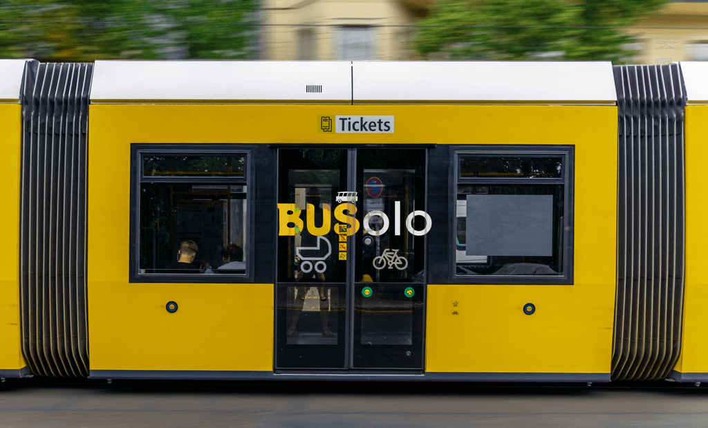
The wordmark keeps Solo inside BUS — the city name is the product name. A batik-derived pattern runs under the dark navy as a quiet local signal rather than a decorative one, and the yellow is pulled straight from the city’s own buses.
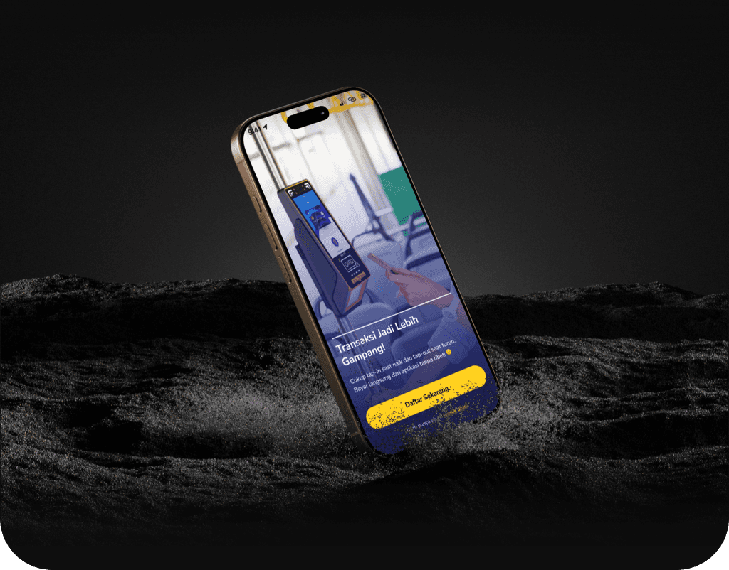
Interface
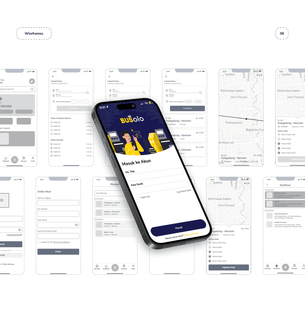
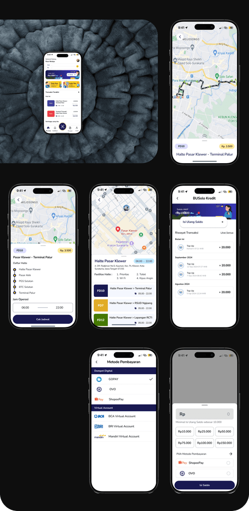
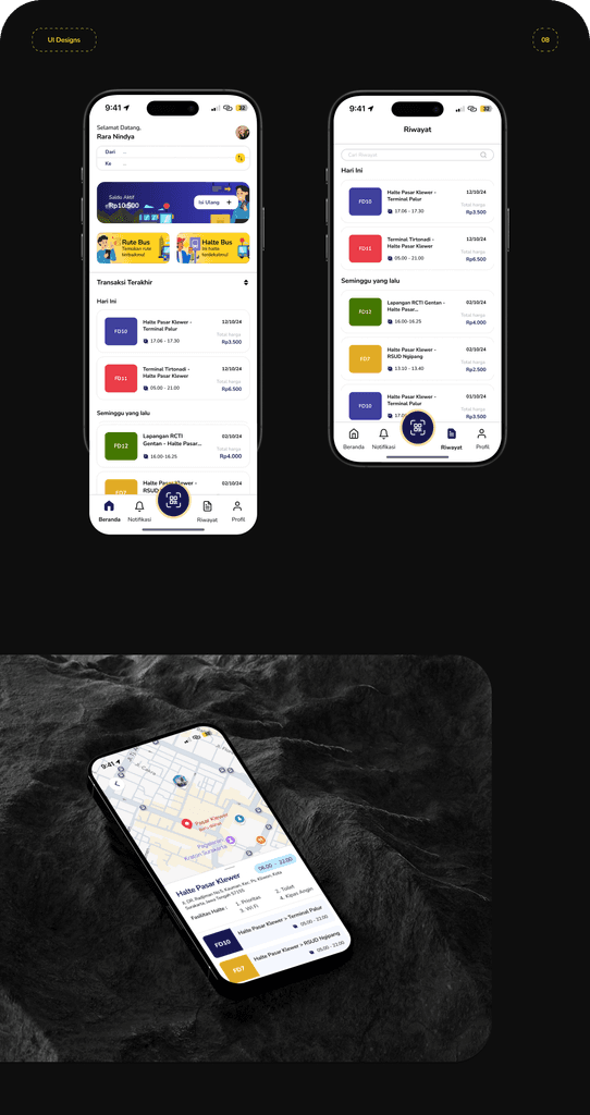
Live map with real-time position, stop detail with the full list of halte and operating hours, a wallet with top-up and transaction history, and digital payment through e-wallet or virtual account.
User testing
Testing with seven participants aged 19–27, grouped into route info, accessibility and design interface.
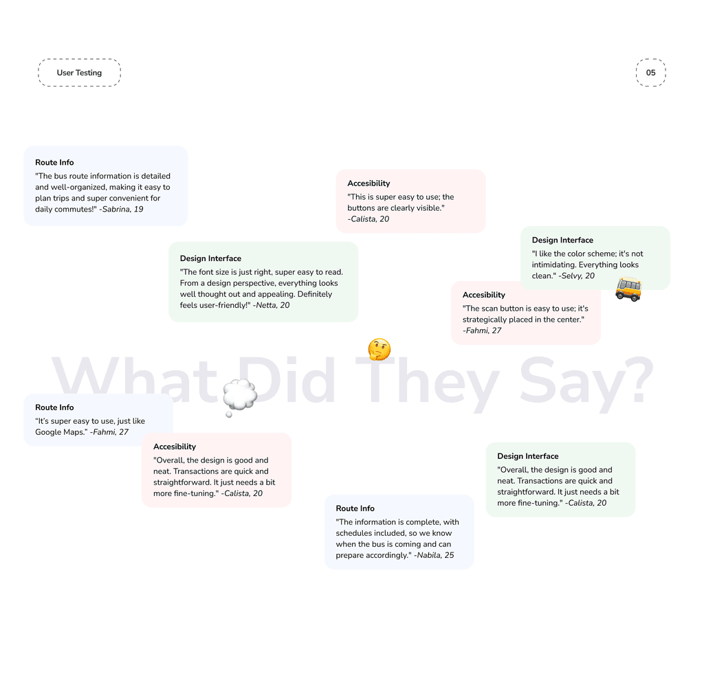
The last quote is the useful one. “Needs a bit more fine-tuning” pointed at spacing inconsistencies in the transaction list, which went back into the system rather than being patched on one screen.